Sunday, July 12, 2026

Rapids Kit Rankings Away Top 10

Here we go with the best of the alternates!

#10 - 2007-2008
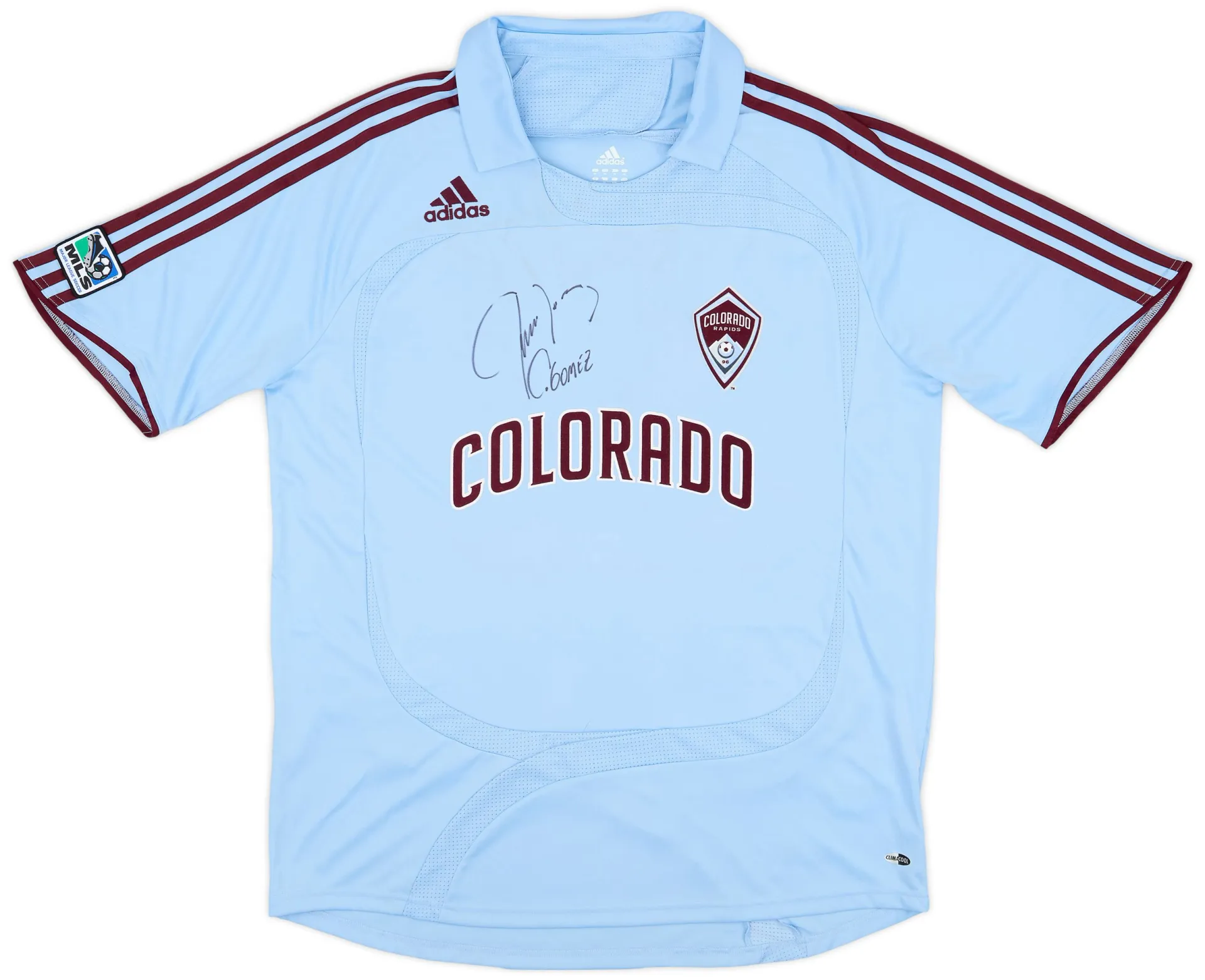
Our first light blue kit, and it really worked with the burgundy trim.  The big drawback on this one is the badge that says 'Colorado Rapids' and then right below it the big 'Colorado' across the front of the kit.  It would have been better as a clean blue kit.  I could take or leave the collar as well.

#9 - 2009-2010
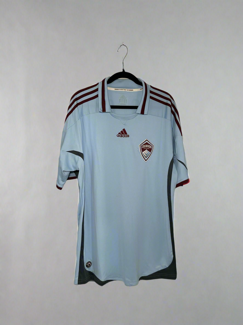
See, better without the 'Colorado' on the front.  This collar works a bit better too IMO.  Otherwise only minor changes from the prior kit.

#8 - 2021-2022

The Class V mountain kit.  Love the goal to raise awareness of protection of our 14ers, love the idea of using the topographic map, loved the return to green, execution left a lot to be desired.  From any sort of distance this looked like a white kit with mint trim.  Also, once again, changing the badge which is an automatic deduction unless it knocks it out of the park, which this doesn't.  I like the clean style however.

#7 - 2001-2002

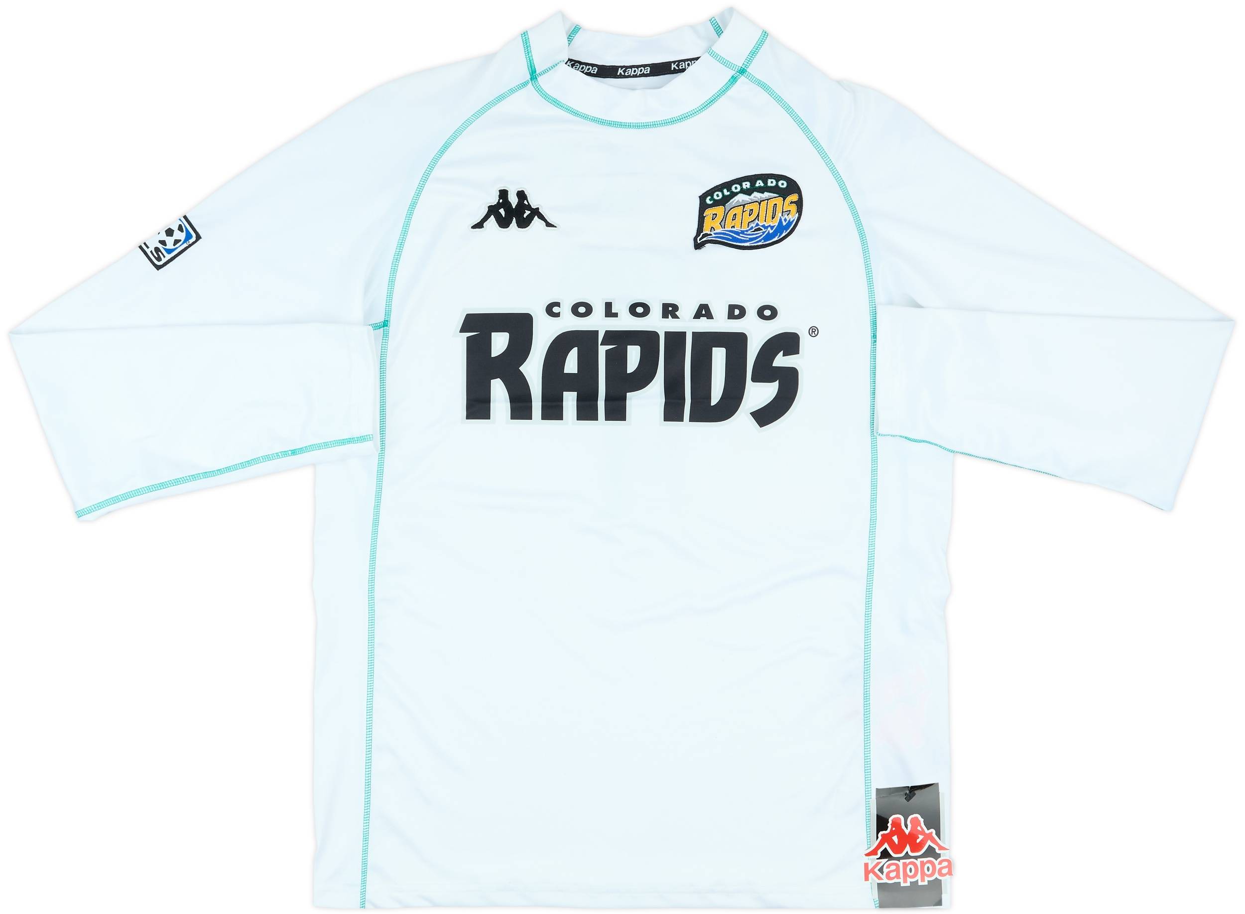
Nicknamed the Aquaman kits these were the first to shift from the baggy 90's style to the more skin-tight, hard to grab, modern style.  Great for top shape soccer players, not so great for out of shape fans like yours truly.  Otherwise it was a white kit with green trim and double Rapids logos.  Its the last Kappa road kit.

#6 - 2025-2026(?)

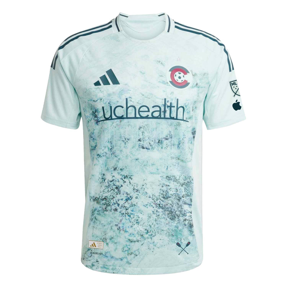
The current road kit.  Much like the mountains kit I love the goal of river protection, concept, and color, but execution was a stumble.  This one from a distance looks like moss or mold on the kit.  I actually like the completely different badge, I just wish it was an already established design and not something new for this kit.  We will be getting a new road kit either right before or right after the sprint season.  I think it will be before, but it a bit unclear.

#5 - 1997-1998

I like this color of green for the kit and the black trim works.  Still, it is just a green kit.  But that makes it almost top 5 on its own.

#4 - 2023-2024

The 'New Day' kit, to promote awareness of mental health.  An important topic and all the more so coming out of the pandemic.  A great design going back to our light blue secondary color and designed by local artist Pat Milbery.  This was the only one of this new run of away kits to support local movements that I think worked on all levels so far.  Still not sold by changing the badge colors, but at least its a secondary club color.


#3 - 1996

The original, and IMO still one of the best.  No big Rapids across the front, a bold green/white design for the 90's (understated for the time if anything), and the gold numbers play off the gold in the badge well.  Almost impossible to find now and impossible to find at a good price.  LAst year's anniversary kits should have taken more from this design to be a true throwback.

#2 - 2006

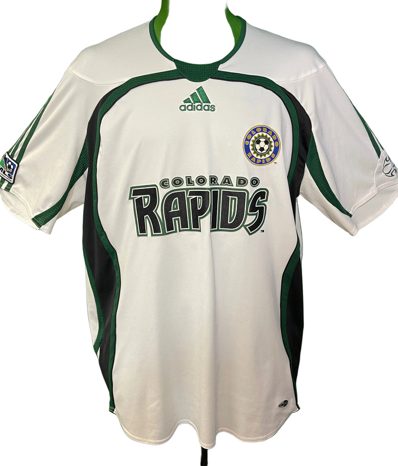
After four years of the awful black and blue we got some green back in our kit.  This is almost the same as the 2005 kits but the green works so much better than the blue.  Adding the green around the collar and down the inside of the sleeves was a big improvement.  I might be biased too as this was the first or the kits I went out to buy for my collection.

#1 - 1999-2000
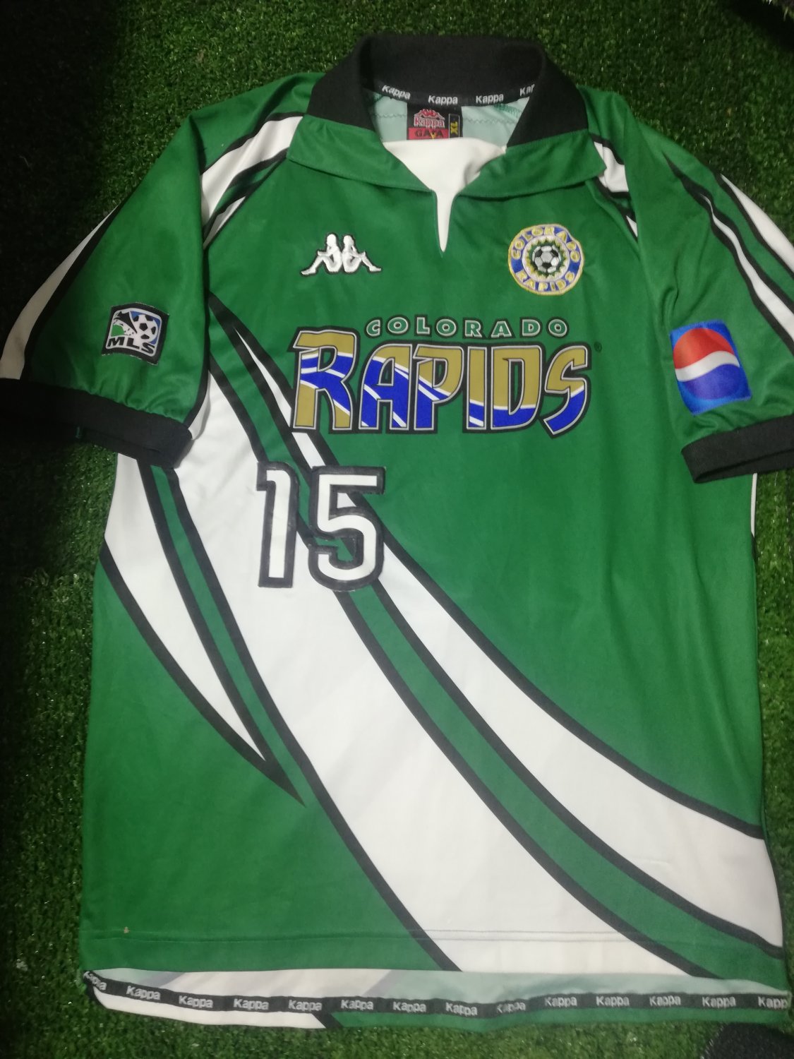
This is easily the best road kit we've had.  A good 90's style with the white trim, the true Rapids green, and its the reverse of the home kit for consistency.  Still stuck with the double Rapids but at least this one is the circular logo as the badge and then a form of the original badge on the front of the kit.  I've got one of these in my collection but I only bring it out for important matches as its a little tight on me, and I don't want it to wear out.

So that's it.  Combined with the first post that's all 17 Rapids road kits ranked.  Where will the 2027 kit fall?

No comments: